
dsigns guides · Create content
Use and style every widget
Choose what each region shows, then adjust its appearance.
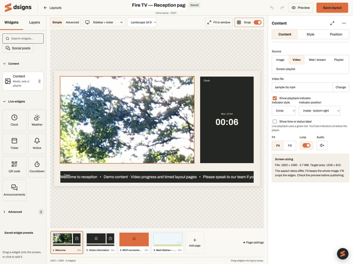
Content: images and video
Example: keep a Canva café menu in the main region and loop a short product video beside it. Add Content, then choose Image or Video as its source. Choose a file from Media; upload or export from Canva to Media first if it is missing. Fit keeps the whole picture visible and can leave space around it. Fill fills the region and may crop its edges. Video offers Loop and an audio toggle; screen Volume also applies. Start with JPEG/PNG and device-supported H.264 MP4. Layout regions use browser codecs, so a file that works in native fullscreen playback may not work in a layout.
Content: reusable and scheduled playlists
Example: reuse one promotions playlist across several reception screens, or let a menu region follow breakfast and lunch schedules. Choose Playlist, then select an existing shared playlist. Edit playlist opens its items, order, durations and random-order setting. Saving changes the shared draft everywhere it is used; players receive it after publication. Check the optional publish-on-save setting before saving. Use Screen playlist instead to follow each assigned screen’s default playlist and schedule. You can add multiple independent regions. They are not synchronised as a video wall. For Canva screen actions, Screen playlist regions show the selected action within those regions; without a visible Screen playlist region, an active Canva action temporarily covers the layout fullscreen. The saved layout returns after the action ends.
Scrub and preview media
Move across a playlist thumbnail in the chooser to inspect its items; keyboard arrow keys also step through its thumbnail preview. In a selected playlist widget’s Content tab, move over or select an item below the canvas to show it in that region. Video thumbnails are cached stills; open Preview to inspect motion. These are preview controls, not changes to saved order or playback time. Use Preview to watch the loop. Imported document pages behave like other playlist images.
Clock
Example: show local time in reception or separate clocks for offices in different cities. Add Clock and choose Digital or Analogue. Set the timezone, such as Australia/Brisbane or Europe/London. Digital offers 12/24-hour time. Switch the date, time, seconds and timezone text on or off; analogue also offers dial numbers. Keep at least one detail visible. Use Style for card backgrounds, corners and text. Keep the device clock accurate; a timezone does not repair an incorrect system clock.
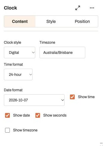
Actual app controlsThe timezone is independent of the browser’s clock. Weather
Example: show local conditions in a hotel foyer or an outdoor activity reception. Add Weather. Set a display name in Location, enter Latitude and Longitude, then choose °C or °F. Choose Stacked or Side by side and switch the location, icon and conditions on or off. Attribution stays visible. Use Search places and choose a result to set the coordinates, or enter them manually. Editing only the Location label does not change coordinates. Weather comes from MET Norway and includes attribution. It needs connectivity to refresh; previously fetched data can be used while fresh enough, but it is not a guaranteed live forecast during an outage.
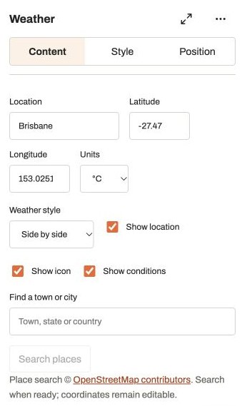
Actual app controlsLocation is a display label; coordinates determine the forecast. Ticker and Notice
Example: use a Ticker for short opening-hour reminders along the bottom of a menu. Use a Notice for a fixed “Please check in at reception” message. Ticker scrolls text continuously. Choose List and enter one item per line, then adjust Speed. RSS/Atom and JSON URL are also available: see feed setup and fallback examples. Notice is a fixed message; type it in Message and use line breaks as needed. Both have text and panel styling. Ticker text follows the scrolling strip rather than the left/centre/right alignment controls used by other text widgets.
QR code
Example: link a restaurant screen to its current online menu, an event screen to registration, or a shop display to a product page. Add QR code and enter a complete http:// or https:// destination, without a username or password. Add a caption if useful. In Style, choose Classic, Rounded or Dots, QR colour and QR background. Choose an optional centre logo from your static Media images, or remove it. Keep a dark pattern on a light background; low contrast can be saved but blocks publishing. The code stays square inside its region, with a clear border. A short URL gives a less dense code. Scan it on the actual screen at the intended viewing distance, including with your chosen logo.
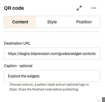
Actual app controlsUse the final public destination and scan the displayed code before publishing. Countdown
Example: count down to the next event, a store opening or a session start, then show “Doors are open”. Add Countdown. Set Count down to and Timezone; the entered time belongs to that zone, not necessarily your computer’s zone. Add an optional heading and text for When it finishes. The widget shows days, hours, minutes and seconds, then keeps the finish message visible. Change times that fall in a skipped or repeated daylight-saving hour. It uses the player’s clock and does not need a live feed.
Announcements
Example: rotate a welcome, parking instructions and opening hours in one reception panel. Choose this when each message needs a few seconds to read; use Notice for one fixed message or Ticker for a continuous strip. Add Announcements for a rotating set of messages. Edit the text blocks, use their up/down arrows to reorder, and use the remove button to delete a message. Add announcement adds another, up to 50. Set Seconds per announcement from 2 to 3,600; each message can override the default with its own duration. Choose Fade in or Cut. Select a message number to inspect it, then use Preview for the loop. Blank messages are skipped; each message can contain up to 2,000 characters.
Custom HTML
Example: create a branded opening-hours panel or a simple event timetable. Open Advanced in Widgets and add Custom HTML. Paste self-contained HTML, CSS and JavaScript. The editor has line numbers and basic syntax feedback; select an issue to jump to its location. Expand settings gives the code more room and reduces the canvas above it. The panel scrolls independently. Code checks do not run your script or prove runtime behaviour. Save to refresh the isolated preview. External scripts, direct network requests, forms and device access stay blocked.
Set fonts, colours and panel appearance
Select a widget and choose Style. Text widgets offer Archivo, Inter, Noto Serif or Roboto Mono; size from 12 to 240; Bold and Italic; text colour; and left, centre or right alignment where applicable. Colours accept a picker or six-digit hex value, such as #F0642C. QR text settings affect the caption, while QR colour settings affect the code. Custom HTML uses its own CSS; Content widgets keep their source artwork’s typography.
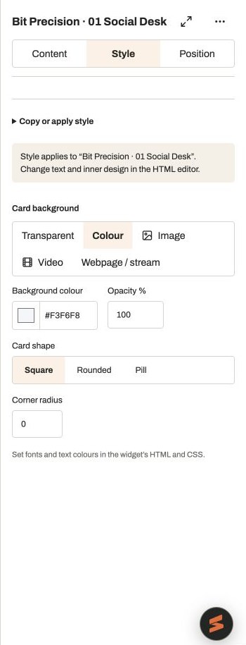
Actual app controlsSelect a widget, then open Style to adjust its appearance. Control space and transparency
Open Style → Card background for Transparent, Colour, Image or Video. Colour offers opacity; media offers Fit or Fill. Background videos loop muted. Choose Square, Rounded or Pill, or set a custom Corner radius. Text widgets also offer Padding. Padding and radius range from 0 to 160 and scale with the canvas. Fonts and background media are included with published content. Use the current layout-capable release listed in Downloads. Publication checks the capabilities reported by the installed player.